Business Intelligence (BI) puts together business analytics, data mining, data visualization, technology resources along with the best practices to help companies make more data-driven decisions. Business intelligence can help businesses make better choices by displaying present and historical data in their business context. Analysts can use data visualization to provide performance and competitor benchmarks for a smoother and more efficiently run organization. Analysts can also detect market trends to boost sales or income more quickly. Making sure you are using BI and data visualization properly is important. Let’s look at how you can choose the right data visualizations for your company.
Temporal Visualizations
In the temporal category, data visualizations belong if they satisfy two conditions: they are linear, and they are one-dimensional. Temporal visualizations normally have lines that either stand alone or intersect with each other, with starting and ending time. Some common examples of data visualizations include scatter plots, time series sequences, timelines, line graphs, and polar area diagrams. These visualizations are usually pretty easy to recognize and understand. Picking the right visualization all depends on the kind of story you are trying to tell. When choosing a temporal visualization, your end goal should be comparing one or many value sets. This can help you easily show the low and high values of a data set.
Hierarchical Visualizations
In the hierarchical category, data visualizations are those that organize groups within larger groups. These are best used to display clusters of information, especially if they flow from one point to another. Typical hierarchical visualizations are tree diagrams, ring charts, and sunburst diagrams. Just like any type of data visualization, it is important that you are effectively telling a story with the graphics that you use. For this type, showing levels of importance coming from a single source is the main purpose of these visualizations. The only downside is that these graphs tend to be complex and sometimes difficult to read. The tree diagram is used most frequently because of its easy-to-follow linear path.
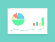
Multidimensional Visualizations
While linear data is easier to understand, sometimes you have the need to capture your audience’s attention. Multidimensional displays two or more different variables to create a 3D data visualization. These types of visualizations are scatter plots, pie charts, Venn diagrams, stacked bar graphs, and histograms. These visuals can break down a ton of data into key takeaways, making it easier to clearly identify what you are trying to get across. Multidimensional is used to compare data and parts of a whole and show relationships between two variables. With multidimensional data, you are able to choose different colors and shapes to really customize your graphic.
Data Visualization Makes an Impact
Choosing the right visualization for your data directly impacts how it gets across to the viewers. Your main goal should always be to properly tell a story with the graphics that you use. Data visualization allows you to display specific data in an eye-catching way leading to a successful conveyance of important and relevant information.