Full Sail Partners Blog | Timothy Burns

Posts by Timothy Burns:

When Should a Firm Using Deltek Vantagepoint Consider a Business Intelligence or Outside Reporting Tool?

Posted by Timothy Burns on March 28, 2024

03-28-24 BI and Reporting Tool - Banner

In today's data-driven business environment, project-based firms face unique challenges that require comprehensive and flexible analytical capabilities. While Deltek Vantagepoint provides robust dashboards and visualizations, there are instances where the depth and breadth of analysis needed by firms surpass what's available out of the box. This is where the integration of a Business Intelligence (BI) tool, such as Informer, becomes not just beneficial but necessary.

Navigating Complex Data Landscapes

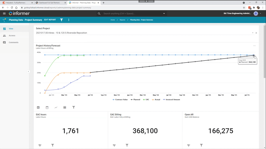
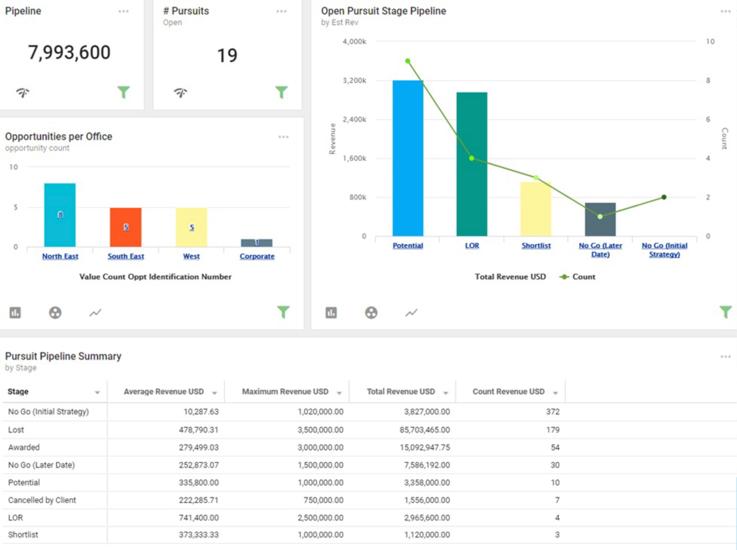
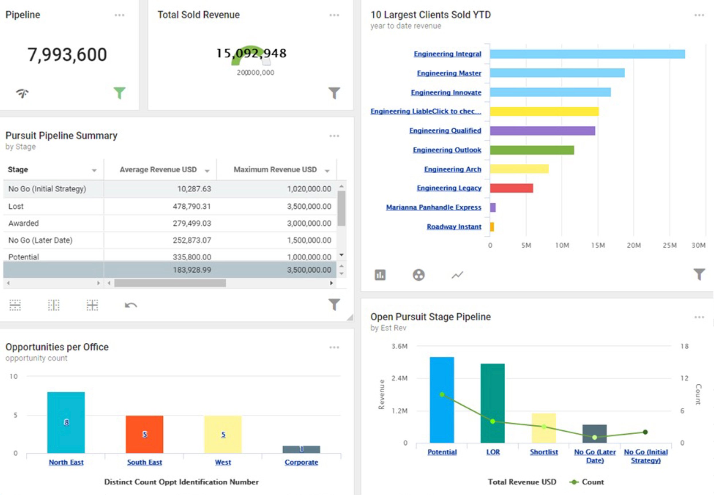
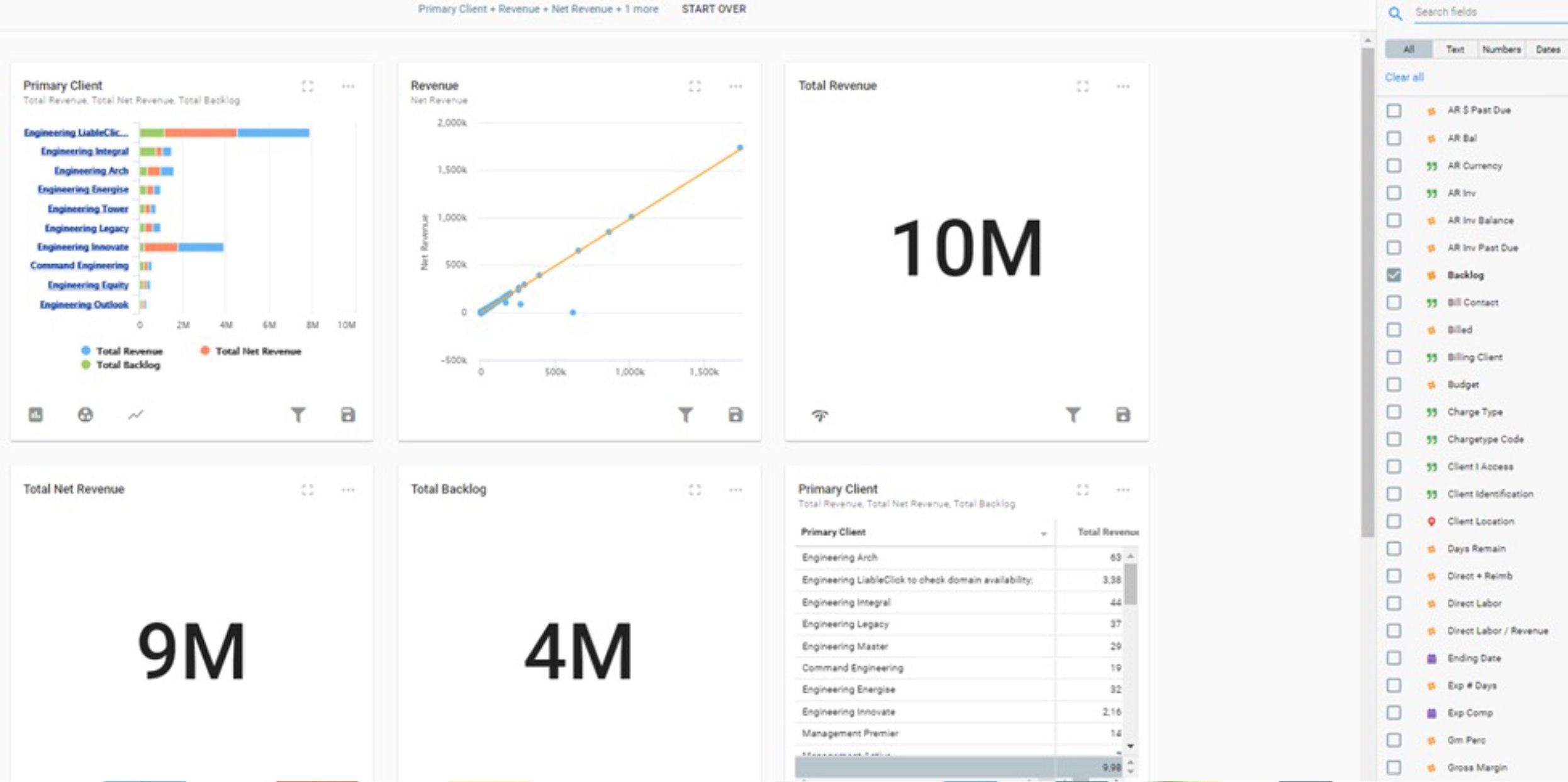
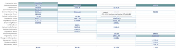
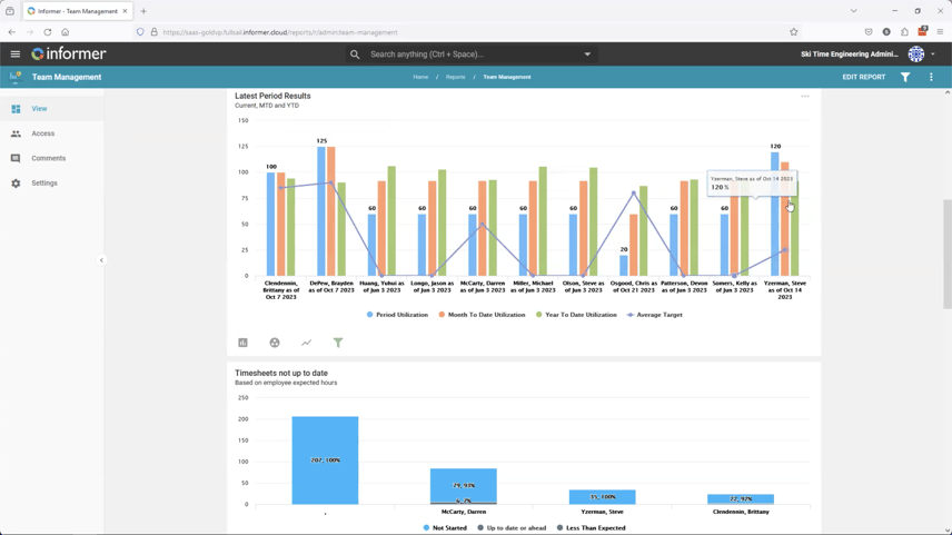
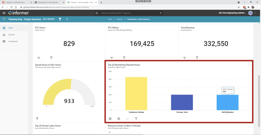
Project-based firms often deal with multifaceted data that sprawls across various Vantagepoint tables or hubs. When the task at hand involves pulling, analyzing, and comparing this data to unearth actionable insights, Informer steps in with its advanced visualization capabilities.

For instance, constructing a dashboard that integrates financial performance data from one table with project timelines from another can reveal insights into project profitability that might not be apparent from isolated datasets.

Informer BI Screenshot

When your firm requires the integration and comparison of data across various Vantagepoint tables or Hubs, a BI tool like Informer BI Solution can provide the enhanced capability needed. This ability to build detailed visualizations using diverse database tables ensures a more comprehensive understanding of your firm's operations and project landscapes.

Merging External and Internal Data Streams

In many scenarios, the data residing within Vantagepoint needs to be enriched with information from external sources to provide a complete picture. This might include integrating information from a payroll provider, client satisfaction surveys, or external financial benchmarks. Informer allows for such integration, offering a unified platform where all data - internal and external - can be visualized and analyzed together. This holistic view is crucial for strategic decision-making, enabling firms to position themselves more competitively in the market.

Informer BI Screenshot 3

Tailoring Reports to Specific Needs

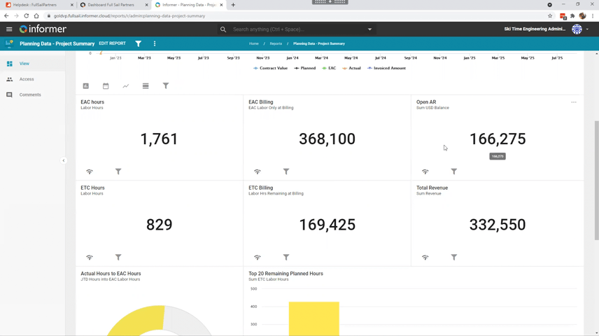
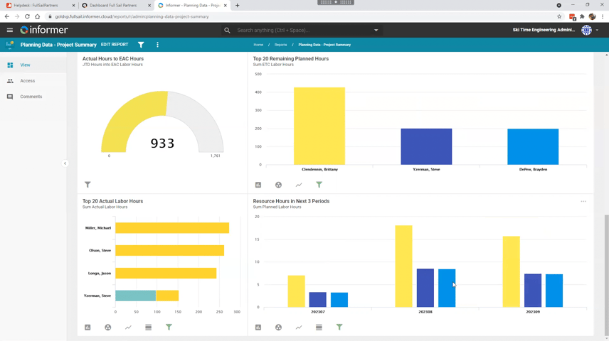
Custom reports stand as a cornerstone for firms seeking in-depth analysis tailored to their specific needs. Unlike standard Vantagepoint reports, custom reporting tools allow for the creation of highly specialized reports that dive into the nuances of your firm's data. This bespoke approach ensures that firms can extract precise insights relevant to their unique projects and operational questions, facilitating strategic decisions rooted in comprehensive data analysis.

Leveraging Merge Templates for Consistency and Efficiency

Firms might consider adopting a BI tool like Informer if they seek to enhance document creation processes. Informer Templates automate and simplify the generation of crucial documents, such as invoices and fee proposals, by allowing non-technical users to apply conditional logic to smart forms. This capability highlights a firm's need for a BI tool when existing systems like Deltek Vantagepoint require extended functionality for efficient, error-free document production. Integrating BI tools ensures consistency and leverages a unified data source for generating key firm documents, indicating a strategic move toward operational efficiency.

Analyzing Scenarios and Forecasting 

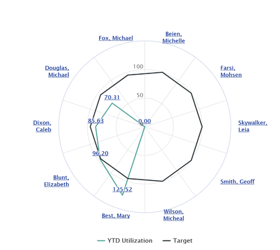
Project-based firms thrive on their ability to anticipate and adapt to future scenarios. Informer's BI capabilities extend to advanced scenario analysis and forecasting, allowing firms to model various future states based on current and historical data. Whether it's forecasting cash flow, assessing the impact of potential market changes on project viability, or analyzing risk, these insights are invaluable for proactive management and strategic planning.

Reviewing Data Just-In-Time for Agile Decision-Making 

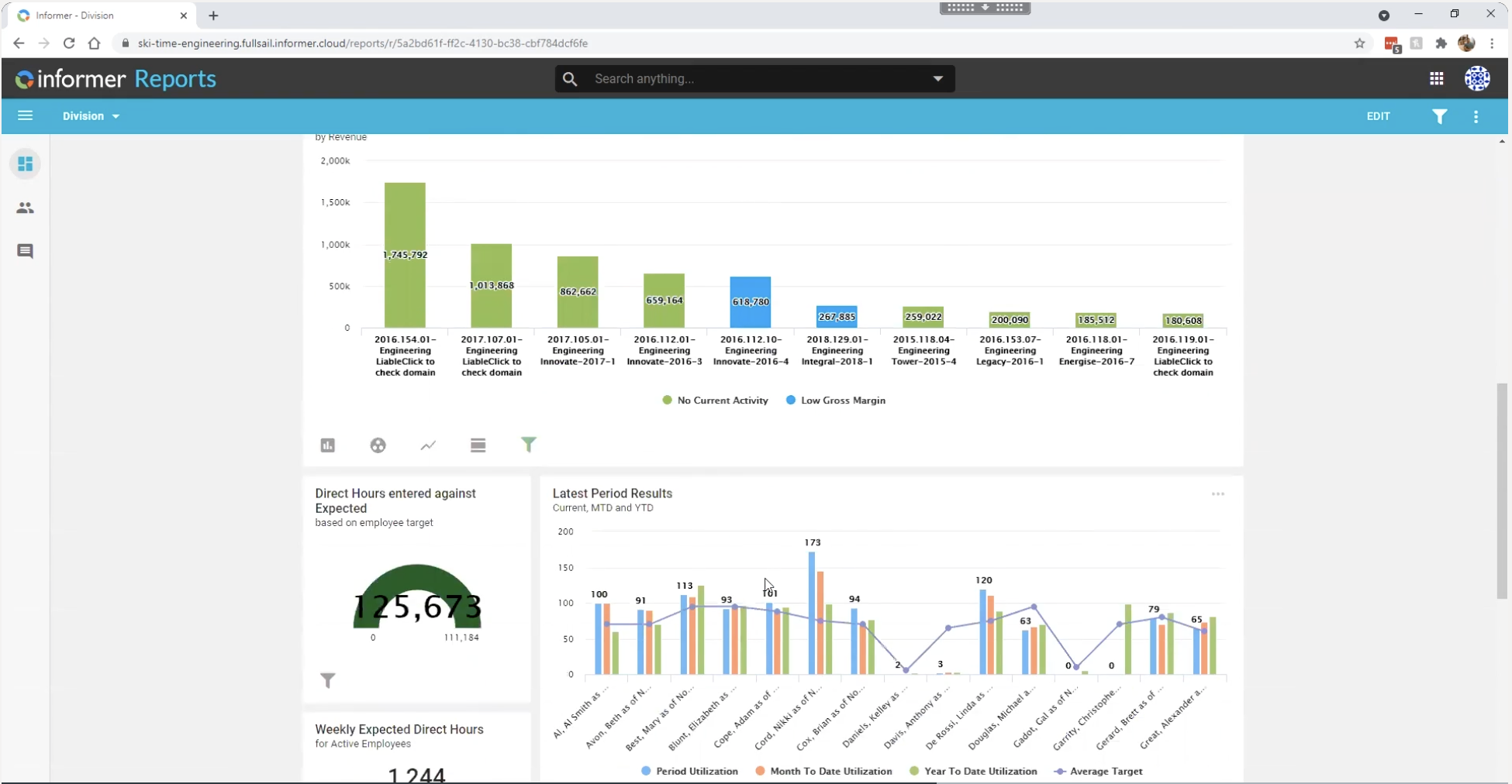
In a fast-paced project environment, the ability to make quick, informed decisions is crucial. Informer offers data visualization on your schedule, enabling firms to monitor key metrics and performance indicators as they happen. This just-in-time capability ensures that decision-makers have the most current information on your schedule, whether it's tracking project budgets, assessing resource allocations, or monitoring project milestones against deadlines.

Informer BI Screenshot 2

Boosting Collaboration with Secure, Accessible Data

Data is most powerful when it's shared and accessible to those who need it. Informer elevates data sharing and collaboration, offering intuitive dashboards and reports accessible anytime, anywhere, ensuring a unified data approach among all team members. This seamless integration is enhanced by the Blackbox Connector for Informer, which aligns with Deltek Vantagepoint’s security protocols. It mirrors your organization's existing hierarchy and roles, simplifying user access management directly within Vantagepoint.

Power Your Projects: Elevate Your Business with Deltek Vantagepoint and Informer

In the world of project management, where data reigns supreme, the partnership between Deltek Vantagepoint and Informer emerges as your key to success. This powerful combination not only merges internal with external data for a comprehensive view but also tailors reporting to your unique needs and delivers insights in real time.

Elevate your project intelligence, streamline operations, and gain a competitive edge. Click on the image below to discover how Deltek Vantagepoint and Informer can transform your business, taking you from mere project management to powering your projects with unparalleled intelligence.

New call-to-action

Maximizing Project Success with Informer's Resource Planning Dashboard

Posted by Timothy Burns on August 03, 2023

08-03-23 Informer Dashboards_Banner

We are excited to introduce you to a game-changing tool that will transform the way project managers review their project financials. Say hello to Informer's Resource Planning Dashboard - a cutting-edge business intelligence tool tailored specifically for project managers, offering instant visibility into your project's performance and empowering you to make well-informed decisions for ultimate success. 

You might be wondering, "What exactly is this Resource Planning Dashboard, and how can it benefit my projects?" Well, let’s dive in and see how. 

Estimate at Completion (EAC) and Revenue Projections

Imagine a project manager, let's call her Lisa, who has been assigned to lead a critical project for her company. Lisa is aware that managing project finances is crucial, but due to various reasons, she neglects to use the EAC and Revenue Projections feature in Informer's Resource Planning Dashboard. 

As the project progresses, Lisa faces challenges in accurately tracking and controlling costs. She relies on outdated spreadsheets and manual calculations, leading to errors and inconsistencies in her financial estimates. Without a clear view of the project's estimated completion costs, Lisa struggles to make well-informed decisions regarding budget allocation and resource management. 

However, with Informer's Resource Planning Dashboard, Lisa gets a comprehensive view of her project's estimated completion costs (EAC). This vital information allows her to accurately assess her project's financial health, giving her and your firm confidence in your financial decision-making.  

Informer Screenshot 01

Informer's Resource Planning Dashboard presents a comprehensive view of your project's estimated completion costs (EAC). This vital information allows you to accurately assess your initiative's financial health, giving you confidence in your financial decision-making. Additionally, the dashboard offers detailed revenue projections, enabling you to forecast your project's income and engage in strategic financial planning. When you have the numbers at your fingertips, financial management becomes a breeze! 

Accounts Receivable (AR) Monitoring 

Now let’s meet John, a project manager leading a crucial infrastructure design project for an engineering firm. Despite being aware of the importance of cash flow management, John fails to use Informer's Resource Planning Dashboard for AR Monitoring. As the project progresses, John faces challenges in keeping track of outstanding payments from clients and subconsultants. 

Without real-time updates on accounts receivable, John is unaware of delayed payments and overdue invoices. This lack of visibility leads to cash flow issues, affecting the project's ability to fund ongoing activities and purchase essential resources. The project falls behind schedule due to the delayed availability of funds, leading to frustrated team members and increased project costs. 

Furthermore, John's inability to proactively optimize the financial situation results in missed opportunities to negotiate payment terms with clients and subconsultants. As a consequence, the project's profitability is compromised, and the firm faces increased financial risks. The cash flow problems escalate, and the project struggles to meet its financial obligations, eventually putting the entire project at risk of failure. 

In this unfortunate scenario, John's failure to leverage Informer's Resource Planning Dashboard for AR Monitoring significantly impacts the project's success. Proper utilization of this feature could have provided him with real-time insights into accounts receivable, enabling proactive cash flow management and ensuring a healthy bottom line for the project. 

Informer Screenshot 02

Effective cash flow management is the lifeblood of any successful project. With Informer's Resource Planning Dashboard, you receive real-time updates on accounts receivable, making it easy to track outstanding payments effortlessly. By staying on top of your cash flow, you can proactively optimize your financial situation and ensure a healthy bottom line for your projects. This feature alone can help you navigate through financial challenges like a pro! 

Resource Optimization 

Imagine Sarah, a project manager leading a critical project for her company. Despite being aware of the importance of resource optimization, Sarah fails to utilize the Resource Planning Dashboard effectively. As the project progresses, Sarah struggles to identify top-performing team members and allocate resources strategically. 

Due to the lack of actionable insights into her project team, Sarah faces challenges in maximizing productivity. She might unknowingly assign tasks to underperforming or overwhelmed team members, leading to delays and compromised project quality. As a result, the project timeline extends beyond the initial projections, causing frustration among clients and eroding their confidence in the project's success. 

Moreover, without the necessary information to optimize resources, Sarah's project team experiences burnout and low morale. The lack of recognition for high-performing individuals, coupled with the inefficient allocation of resources, creates a sense of disengagement within the team. 

The consequences of poor resource optimization are severe. The project incurs additional costs due to inefficiencies and missed deadlines. Clients become dissatisfied with the project's progress and may consider terminating the contract, impacting the company's reputation and future business opportunities. 

In this unfortunate scenario, Sarah's failure to leverage the Resource Planning Dashboard for Resource Optimization significantly impacts the project's success. Proper utilization of this feature could have empowered Sarah to identify top performers, allocate resources efficiently, and unlock her team's full potential. The project would have progressed smoothly, meeting deadlines, and delighting stakeholders with successful outcomes. 

Informer Screenshot 03

The Resource Planning Dashboard provides actionable insights into your project team members, helping you identify top-performing resources. Armed with this knowledge, you can strategically allocate resources, maximize productivity, and enhance overall project execution. It's like having a secret weapon to unlock your team's full potential! 

Empower Your Project Managers with Informer’s Resource Planning Dashboard 

Informer's Resource Planning Dashboard is designed to simplify project management and empower you with the tools you need for unparalleled success. From financial insights to resource optimization, this dashboard covers all the bases, ensuring that your projects are on the path to greatness.  

Are you excited to take your project management game to new heights? Let's embrace the power of Informer's Resource Planning Dashboard and watch the short demonstration by clicking below. Happy planning! 


New call-to-action


The Best Business Intelligence (BI) Tool for Deltek Vantagepoint Users

Posted by Timothy Burns on March 01, 2023

03-02-23_BI-Intelligence-Tools_Banner

One of the topics that keeps arising from the Deltek user base is utilizing business intelligence (BI) tools. Firms are seeking out BI tools for different reasons, but all are looking to provide further analysis and visibility to employees within the firm. Some of the key products firms are investigating include Power BI to Tableau to Informer. So, what is the best BI tool for Deltek Vantagepoint users? Let’s dive in and discuss why firms are searching out BI tools and discuss what we have found to be the best solution. 

Clients Want More

The Deltek Vantagepoint product is robust and provides many out-of-the-box visuals and dashboards, but there are some further capabilities that require users to turn to a BI tool. Some of the most common features include: 

  • Report upon any table or field not just pre-selected datasets 

  • Create visuals combining different hubs or tables (For example, Project and GL Reports) 

  • Enhance drilldown capabilities from a visual

  • Combine outside data from payroll, marketing solutions, etc. 

  • Track against goals, KPIs, and industry benchmarks 

Why Entrinsik Informer Stands Out Amongst Other Business Intelligence Solutions 

  1. Out-of-the-Box Standards– No more starting from scratch and spending months and even years building out something that could be available to you day one. Our team has built what we call the gold standard, a starting point for project-based firms. On the first meeting, our team will show you how your data looks in our out-of-the-box datasets, visuals and dashboards. We will then work with your team to tweak datasets to your definitions and work with you to validate the data. Our gold standard includes visuals from the executive down to the employee and every role in between. 

  2. Reduce Burden on IT – Deploying a BI tool can be cumbersome for technology teams. Our streamlined approach to deploy a BI solution saves time and resources. Most tools require in-depth database programming skillsets, such as SQL. One of the key benefits of Entrinsik Informer is its intuitive and user-friendly capabilities, including dataset and visual design. Informer also scales to meet the needs of organizations as they grow and evolve, so companies do not have to sweat about the future.  

  3. Integrated Security with Deltek Vantagepoint  – Informer utilizes the same security protocols utilized with your Deltek product streamlining the login process. A key advantage is user security data can be assigned in Deltek. As an example, when users are disabled within your Deltek product, they are also disabled within Informer. 

  4. Drilldown Capabilities is Built-in– Informer offers built-in drilldowns to transactional data on visuals. The drilldowns are automatically configured on visuals. In other BI tools, it is just another thing you have to design, but not in Informer. 

  5. Cloud Compatible  – Deltek users in the cloud need not worry. Another benefit of Entrinsik Informer is that it is Deltek cloud compatible by using FLEX direct database access.  

  6. Combine Outside Data – Users can combine multiple outside data sources. For example, firms can bring in payroll data or other third-party solution data for further analysis.

  7. Send Reports and Alerts Based on Conditions – Informer allows users to tap into their data and email certain filtered views to internal or external recipients. Emails and alerts can be scheduled on any conditional criteria. For example, as Project Managers utilize 80% of their budget, an email can be sent with a link to their dashboard and a breakdown of time on their project.

  8. Schedule Data Updates On-Demand– Users can schedule data to be refreshed on-demand or at specific time intervals. Datasets can also be scheduled at separate intervals. Some BI tools lack this flexibility, and all data is refreshed at one time. For example, opportunities may be updated every two hours, projects updated nightly, and income statements updated monthly after postings.

  9. Mobile Accessibility – Dashboards can be viewed on-the-go on any mobile device. One of the key differentiators between Entrinsik Informer and other BI tools is its drilldown capability. Informer content is automatically configured for mobile viewing without any additional development.

  10. Easily Create Firm Documents – Informer is designed to be user-friendly and easy to use, even for those without technical expertise. With Informer templates, firms can automate manual form and template creation with ease. Examples include firm invoices, fee proposals, custom reports, and more. Templates are highly customizable and won’t break when Deltek Vision or Vantagepoint is updated, allowing the template to be used well into the future.

See Informer in Action

Entrinsik Informer provides a combination of ease of use, customization, integration, speed, affordability, and scalability that sets it apart from other business intelligence tools on the market. If you are ready to see more, we recommend checking out this previously presented demonstration webinar to see highlights of the capabilities of the product. Power BI, Tableau, and Informer each offer unique features, but our clients believe Deltek users will find Informer to be the best business intelligence tool option. Click the image below to watch our webinar providing a more in-depth analysis of the capabilities of each of these products and learn what the future holds for BI tools. 


New call-to-action

Amplify Business Intelligence Visuals with Informer

Posted by Timothy Burns on April 12, 2022

2022-Informer_Amplify-Business-Intelligence-Visuals_banner-01

A favorite song is structured to be both instantly recognizable and memorable. It’s written with a predefined structure that is thought out to capture the listeners attention and invoke an emotion. There are several standard ways in which a song is written and some basic rules song writers “should follow” when it comes to writing the song.  

The same can be said to developing business intelligence visuals for project-based firms. A business analyst, like a songwriter, must decide on the different visuals that will come together to create a melody to allow firm leaders to make decisive, but critical decisions. The visuals must grab the attention quickly and be easily understood to the audience. 

This article breaks down how to the Blackbox Connector for Informer amplifies the firm’s Deltek Vantagepoint data to make memorable melody. 

Understanding the Business Intelligence Visual Structure

The basic parts of a song include the intro, verse, pre-chorus/lift, bridge, break, and outro. Let’s compare that to creating a business intelligence dashboard using Informer.  

The intro is self-explanatory – it’s the intro the song or the very first visual on the dashboard. And, it’s one of the most important parts. Typically, it’s the very top left corner visual. This is where the most important statistic or data should be displayed.  

The verse gives the listener (or the viewer in our case) the idea of what the song is about. It typically sets the tone or topic of the entire dashboard.  

The pre-chorus/lift can build anticipation. In a song this includes increasing the volume or rhythm or pulling back and creating silence. When building the business intelligence visual stack, it can be the visuals that keep viewers scrolling through or keep them on the page.  

The chorus is often the most memorable melody of the song. It usually repeats itself throughout the entire song. And, just like in a song, it can repeat the same visuals but maybe for different regions or offices. For example, the dashboard may have several charts that show utilization rates by office with different separate visuals scattered throughout for each region of offices. Think about that one main theme of the dashboard – utilization rate, hit rate, profit, sales target – whatever the theme for that dashboard and make sure it’s repeated in a way that makes sense to make it memorable. 

A break is usually an instrumental part of the song that allows for some breathing room. When creating business intelligence visuals, make sure there is ample white space or breathing room between each individual chart or graph. This gives the audience that break before consuming the next information. 

A good song has an outro – the end of the song. The outro closes out the song just like the business intelligence dashboard needs to close out.

Putting the Structure Together   

Understanding the basic structure of a song (or business intelligence dashboard) is just the first step. Next is to understand how each part works together to create different melodies. Below are some common song structures in modern music and how you can think about these when designing dashboards using Informer.  

Verse-Chorus-Verse-Chorus  

This is probably the most common song structure in today’s music, especially in pop music. And, it’s a great way to begin with designing the BI dashboards.  

Examples of some songs using this structure include: 

  • “Smoke on the Water” by Deep Purple 
  • “All You Need is Love” by the Beatles 
  • “Foxy Lady” by Jimi Hendrix 

Informer visuals using this structure can include visuals showing the following: 

  • Total potential revenue in the pipeline 
  • Opportunity count by office 
  • Total revenue won YTD 
  • Opportunity dollar about by stage 

An example Informer visual using this structure is shown below. 

Amplify_Bus_Intelligence 01


Verse-Chorus-Verse-Chorus-Bridge-Chorus   

Songs that use this structure often get stuck in your head and therefore become popular. The bridge helps add a surprise or variance breaking up the repetitiveness of the song. Using this structure when designing the business intelligence dashboards can add a new angle or different theme while supporting the main goal or theme.  

Examples of songs using this structure include: 

  • “Happy” by Pharrell 
  • “Every Breath You Take” by the Police 
  • “Fix You” by Coldplay
 

Taking the example from above, the bridge added could be: 

  • Total potential revenue in the pipeline 
  • Opportunity count by office 
  • Total revenue won YTD 
  • Top 10 largest clients by YTD revenue 
  • Opportunity dollar about by stage

By adding the top 10 largest clients, the viewer can get a sense of what clients the firm should be focused on, which stays with the theme of the overall visual – business development. But that specific chart is revenue earned not expected revenue or sales won. It’s a different angle of information but still very helpful to the business development team. 

An example Informer visual using this structure is shown below. 

Amplify_Bus_Intelligence 02


Create Visuals Easily with Informer Discover Tool 

Informer is a business intelligence tool that uses the Blackbox Connector to connect to Deltek Vision or Vantagepoint and create a standard set of datasets. Using the Blackbox Connector with Informer allows the team to start building visuals right away instead of spending a lot of time building datasets and programming visuals.  

Once the data is connected, go to a dataset and select the Discover Tool. Then choose a field, in this example Project Summary is selected. The Discover Tool instantly recommends visuals based on the data selected. The tool recommends visuals based on the fields and columns selected and changes the recommendations as you select more or less options. 

Amplify_Bus_Intelligence 03


Each recommended visual can then be adjusted or further designed based on the needs. It can then be saved to be used later to create dashboards (called Reports in Informer).   

Tips for Choosing the Right Visual Structure 

Knowing the structure and different visual types while using the Informer Discover tool to make the visuals easily, how do you decide what visuals to display for firm leaders? The dashboard should not just be pretty, but also functional. It’s helping firm leaders make critical decisions, after all. Below are a few tips to choose the right visual structure. 

  • Understand the audience – Knowing who will be using this dashboard to make decisions will help determine the key metrics to display. What information does the audience need to be successful? Keep in mind that the visuals are just an overview and the audience can drill down into the data, if desired. 
  • Stick to one main theme – It doesn’t make sense to throw in a chorus of playing ball in a country song about losing ‘the girl.’ So don’t mix in too many different types of data that don’t support the main theme. It’s okay to create multiple dashboards and tools like Deltek Vantagepoint and Informer allow users to quickly access different dashboards, if needed. 
  • Incorporate different visual types – Sticking to one main theme, doesn’t mean using the same visual. Create a visual story by choosing different types of charts, graphs, and tables. Just be careful to select the visual that matches the data type. The Informer Discover Tool does this easily by recommending the visual types for the data selected. 
  • Use color wisely – Every color can tell a story. Don’t use too many colors to distract viewers. Instead use color to show differences or areas to the viewer should focus. Using red for negative, green for positive, and grays to show values is a great way to use color wisely.  
  • Keep it simple – Because the Informer Discover Tool makes it easy to create different types of visuals for any type of Vantagepoint data, it might be tempting to add it all to a dashboard. It’s very important to keep in mind the end-user or audience that is using the visuals to make decisions. Keep the most important visuals in the top left corner. If the viewers are overwhelmed by the sheer amount of visual stimulation or there’s too many clicks to drill down to data, it won’t be valuable to them.  

Write the Firm's "Greatest Hit" with Blackbox Connector for Informer  

Knowing all the parts and possible structures of songs and business intelligence visuals is a first step to writing that greatest hit for the firm. Remember that the point of providing BI visuals to firm decision-makers is to make all the firm’s data understandable and therefore, becoming actionable based on the information presented.  

To see the Informer Discover Tool in action click the image below to access a mini-demo.

New call-to-action

Business Intelligence Users Can Visualize More with Entrinsik Informer 5.4

Posted by Timothy Burns on August 04, 2021

Seeing is believing, and with Entrinsik Informer, many different types of professional services firms already have the ability to quickly visualize and analyze data to make informed business decisions. Informer, a highly ranked business intelligence (BI) solution, allows users firmwide to create customized dashboards and easily drill down into the data pertaining to their specific department and role to find the answers to questions or get status reports on areas of concern.

Informer BI logo

So much insight can be gained already using Informer. However, with the latest release of Entrinsik Informer 5.4, employees at professional services firms now have new and improved features to improve data visualization.

Enhancements with Informer Template Creation

Templates are an exciting new feature in Informer 5.4. Templates are custom formatted outputs using HTML coding. This allows total pixel-perfect control over the end product. The template code is in HTML, but being an HTML expert is not required. Many users of the Informer business intelligence tool have little or no HTML experience when they first start. Some even creating a template in less than a day.

Using the data that resides in a firm’s Deltek Vision or Vantagepoint system, firm employees are able to customize the final output into almost any format. The first step is to get the data organized into datasets so that it is easily available for the template. Then it is simply creating the template in the format the user wants.

Within the template, logical formulas can be applied. For example, if the invoice on an accounts receivable (AR) statement is past due, it can be shown in yellow highlight, or if survey is checked in an opportunity, specific survey language can be inserted into the agreement that is being sent to the client.

Additionally, users will be able to create a CSS (Cascading Styles Sheet) for templates to standardize the firm’s output and have logos readily available. Even more, there is also a way to save those commonly used expressions, so it is not necessary to retype every time.

Some of the uses for the templated output are:

  • Client Agreements
  • Compensation Reports
  • Financial Reports
  • Project Status for Clients
  • AR Statements
  • Custom Invoices
  • Governmental Reporting (DOT reports)

Once a templated output is set up, it is repeatable and can be shared firm-wide with the appropriate staff.

New Ways to Look at Data

Informer 5.4 also offers different ways to visualize data. Within the Informer 5.4 visuals tab, new visualization charts are available, heat maps and spider charts, which allow fresh perspectives to analyze important data.

A heat map is a graphical representation of data where values are guided by color accent with the deeper the shade, the higher the value. Heat maps are a great way to see concentrations in the data and are really useful if there is a lot of data to manage. In this example, at first glance, the color variations easily indicate the different values and can guide evaluation.

Informer heat map chart example

A spider chart, by comparison, is a helpful way of showing outliers. For example, a spider chart may show employees with the highest or lowest utilization. By viewing the chart, it is apparent that Mary Best is exceeding her utilization target, while Michelle Beien, Moshen Farsi, Leia Skywalker and Geoff Smith are not.

Informer spider chart example

See More than Before with Informer 5.4

The Entrinsik Informer 5.4 release was developed to improve how users can take their BI further and visualize their data so that better and quicker decisions can be made. With this newest release, users of Informer across the firm will have even better options for visualizing their data. And, going into the future, as BI needs continue to evolve so will Entrinsik Informer to meet them.

New call-to-action

Latest Posts