
A favorite song is structured to be both instantly recognizable and memorable. It’s written with a predefined structure that is thought out to capture the listeners attention and invoke an emotion. There are several standard ways in which a song is written and some basic rules song writers “should follow” when it comes to writing the song.
The same can be said to developing business intelligence visuals for project-based firms. A business analyst, like a songwriter, must decide on the different visuals that will come together to create a melody to allow firm leaders to make decisive, but critical decisions. The visuals must grab the attention quickly and be easily understood to the audience.
This article breaks down how to the Blackbox Connector for Informer amplifies the firm’s Deltek Vantagepoint data to make memorable melody.
Understanding the Business Intelligence Visual Structure
The basic parts of a song include the intro, verse, pre-chorus/lift, bridge, break, and outro. Let’s compare that to creating a business intelligence dashboard using Informer.
The intro is self-explanatory – it’s the intro the song or the very first visual on the dashboard. And, it’s one of the most important parts. Typically, it’s the very top left corner visual. This is where the most important statistic or data should be displayed.
The verse gives the listener (or the viewer in our case) the idea of what the song is about. It typically sets the tone or topic of the entire dashboard.
The pre-chorus/lift can build anticipation. In a song this includes increasing the volume or rhythm or pulling back and creating silence. When building the business intelligence visual stack, it can be the visuals that keep viewers scrolling through or keep them on the page.
The chorus is often the most memorable melody of the song. It usually repeats itself throughout the entire song. And, just like in a song, it can repeat the same visuals but maybe for different regions or offices. For example, the dashboard may have several charts that show utilization rates by office with different separate visuals scattered throughout for each region of offices. Think about that one main theme of the dashboard – utilization rate, hit rate, profit, sales target – whatever the theme for that dashboard and make sure it’s repeated in a way that makes sense to make it memorable.
A break is usually an instrumental part of the song that allows for some breathing room. When creating business intelligence visuals, make sure there is ample white space or breathing room between each individual chart or graph. This gives the audience that break before consuming the next information.
A good song has an outro – the end of the song. The outro closes out the song just like the business intelligence dashboard needs to close out.
Putting the Structure Together
Understanding the basic structure of a song (or business intelligence dashboard) is just the first step. Next is to understand how each part works together to create different melodies. Below are some common song structures in modern music and how you can think about these when designing dashboards using Informer.
Verse-Chorus-Verse-Chorus
This is probably the most common song structure in today’s music, especially in pop music. And, it’s a great way to begin with designing the BI dashboards.
Examples of some songs using this structure include:
- “Smoke on the Water” by Deep Purple
- “All You Need is Love” by the Beatles
- “Foxy Lady” by Jimi Hendrix
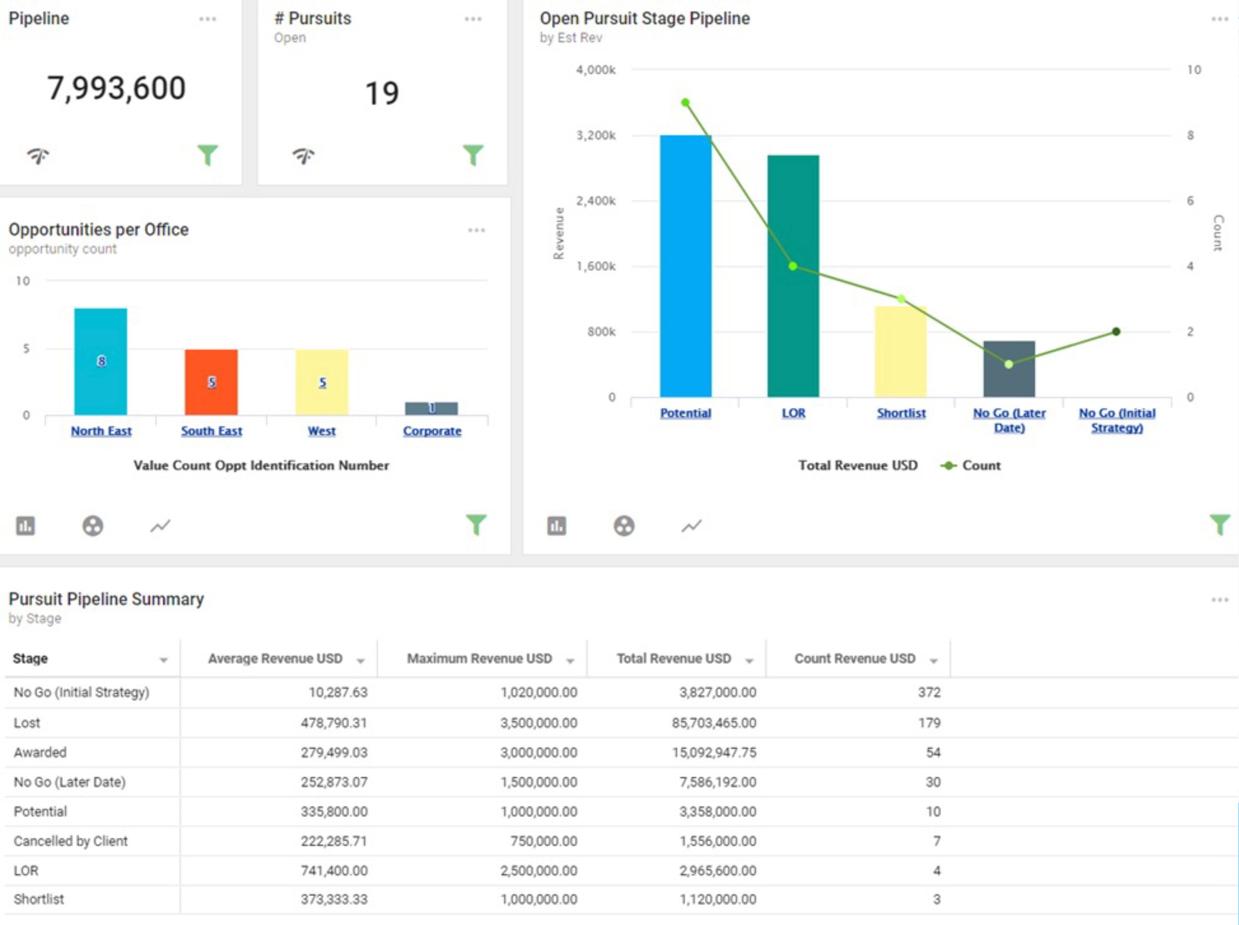
Informer visuals using this structure can include visuals showing the following:
- Total potential revenue in the pipeline
- Opportunity count by office
- Total revenue won YTD
- Opportunity dollar about by stage
An example Informer visual using this structure is shown below.
Verse-Chorus-Verse-Chorus-Bridge-Chorus
Songs that use this structure often get stuck in your head and therefore become popular. The bridge helps add a surprise or variance breaking up the repetitiveness of the song. Using this structure when designing the business intelligence dashboards can add a new angle or different theme while supporting the main goal or theme.
Examples of songs using this structure include:
- “Happy” by Pharrell
- “Every Breath You Take” by the Police
- “Fix You” by Coldplay
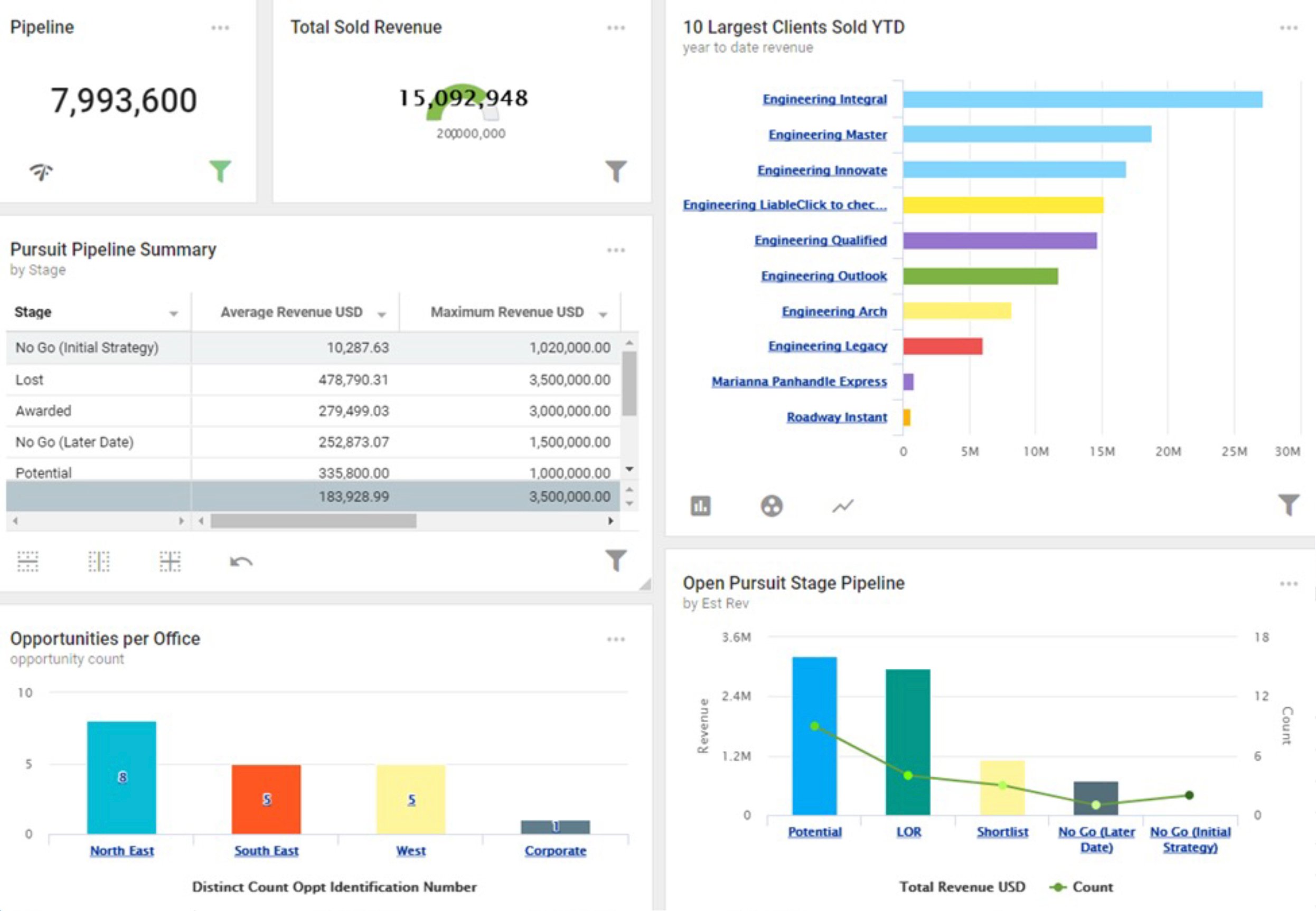
Taking the example from above, the bridge added could be:
- Total potential revenue in the pipeline
- Opportunity count by office
- Total revenue won YTD
- Top 10 largest clients by YTD revenue
- Opportunity dollar about by stage
By adding the top 10 largest clients, the viewer can get a sense of what clients the firm should be focused on, which stays with the theme of the overall visual – business development. But that specific chart is revenue earned not expected revenue or sales won. It’s a different angle of information but still very helpful to the business development team.
An example Informer visual using this structure is shown below.
Create Visuals Easily with Informer Discover Tool
Informer is a business intelligence tool that uses the Blackbox Connector to connect to Deltek Vision or Vantagepoint and create a standard set of datasets. Using the Blackbox Connector with Informer allows the team to start building visuals right away instead of spending a lot of time building datasets and programming visuals.
Once the data is connected, go to a dataset and select the Discover Tool. Then choose a field, in this example Project Summary is selected. The Discover Tool instantly recommends visuals based on the data selected. The tool recommends visuals based on the fields and columns selected and changes the recommendations as you select more or less options.
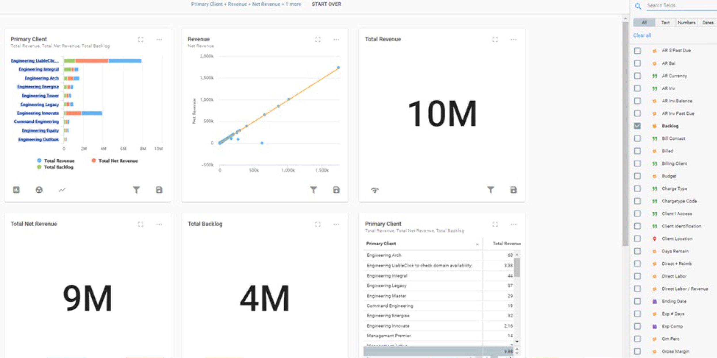
Each recommended visual can then be adjusted or further designed based on the needs. It can then be saved to be used later to create dashboards (called Reports in Informer).
Tips for Choosing the Right Visual Structure
Knowing the structure and different visual types while using the Informer Discover tool to make the visuals easily, how do you decide what visuals to display for firm leaders? The dashboard should not just be pretty, but also functional. It’s helping firm leaders make critical decisions, after all. Below are a few tips to choose the right visual structure.
- Understand the audience – Knowing who will be using this dashboard to make decisions will help determine the key metrics to display. What information does the audience need to be successful? Keep in mind that the visuals are just an overview and the audience can drill down into the data, if desired.
- Stick to one main theme – It doesn’t make sense to throw in a chorus of playing ball in a country song about losing ‘the girl.’ So don’t mix in too many different types of data that don’t support the main theme. It’s okay to create multiple dashboards and tools like Deltek Vantagepoint and Informer allow users to quickly access different dashboards, if needed.
- Incorporate different visual types – Sticking to one main theme, doesn’t mean using the same visual. Create a visual story by choosing different types of charts, graphs, and tables. Just be careful to select the visual that matches the data type. The Informer Discover Tool does this easily by recommending the visual types for the data selected.
- Use color wisely – Every color can tell a story. Don’t use too many colors to distract viewers. Instead use color to show differences or areas to the viewer should focus. Using red for negative, green for positive, and grays to show values is a great way to use color wisely.
- Keep it simple – Because the Informer Discover Tool makes it easy to create different types of visuals for any type of Vantagepoint data, it might be tempting to add it all to a dashboard. It’s very important to keep in mind the end-user or audience that is using the visuals to make decisions. Keep the most important visuals in the top left corner. If the viewers are overwhelmed by the sheer amount of visual stimulation or there’s too many clicks to drill down to data, it won’t be valuable to them.
Write the Firm's "Greatest Hit" with Blackbox Connector for Informer
Knowing all the parts and possible structures of songs and business intelligence visuals is a first step to writing that greatest hit for the firm. Remember that the point of providing BI visuals to firm decision-makers is to make all the firm’s data understandable and therefore, becoming actionable based on the information presented.
To see the Informer Discover Tool in action click the image below to access a mini-demo.
