Artificial Intelligence and Machine Learning? Not Science Fiction Anymore
As many relate these terms with science fiction and robotics, artificial intelligence (AI) and machine learning can cause some confusion. Based on common knowledge, this is a rational thought. However, AI and machine learning technologies have been and continue to be incorporated into many software applications and personal assistant tools such as Siri and Alexa. Furthermore, it is important to note that AI and machine learning have some slight differences. So, in this blog, let’s take a closer look at AI and machine learning and how Deltek is using these technologies to improve the experience for Deltek Vantagepoint users.
Getting Smart with Artificial Intelligence
Simply stated, AI is the principle that machines can make smart decisions and complete tasks using logical intelligence. In theory, this means that machines using AI exhibit cognitive functions like those performed in human minds. AI works by using algorithms, and in many cases, multiple complex algorithms stacked on top of each other. Typically, these algorithms can learn from data, enhancing the ability to make smarter decisions.
The late Larry Tesler, a computer scientist who worked for many major corporations, tried to define AI. His theorem stated that “AI is whatever hasn’t been done yet,” meaning that intelligence is ever-changing. However, once something becomes common, it transitions to machine learning. Tesler’s theorem is often referred to when discussing the difference between AI and machine learning.
Being Efficient with Machine Learning
So, based on Tesler’s theorem, machine learning is a subcategory of AI and focuses more on the idea that machines can learn and adapt through experience. Like AI, machine learning uses algorithms to perform tasks without being programmed to, but it achieves goals by learning and figuring things out over time. In machine learning, the commonly accepted approaches are divided into four categories:
Reinforcement Learning – a computer program navigates a dynamic environment to achieve a goal, such as a car on a racetrack. The car is given positive reinforcement when it stays on the course and negative reinforcement when it leaves the track. Over time, the program will be able to drive the car through the entire track.
Supervised Learning – the program is given inputs and desired outputs and then it creates the connections. An example of this is creating models to predict the weather.
Unsupervised Learning – As the name suggests, the program is given no pre-existing labels and left to figure out patterns in the data on its own. This technique is often used in marketing to identify clusters of potential customers.
Semi-Supervised Learning – Mixing Supervised and Unsupervised, the program is given a mix of labeled and unlabeled data. This technique is often used to build translation models, as labeling all possible translations is expensive and time-consuming, but making assumptions on unlabeled data is much cheaper.
Using AI and Machine Learning within Deltek Vantagepoint
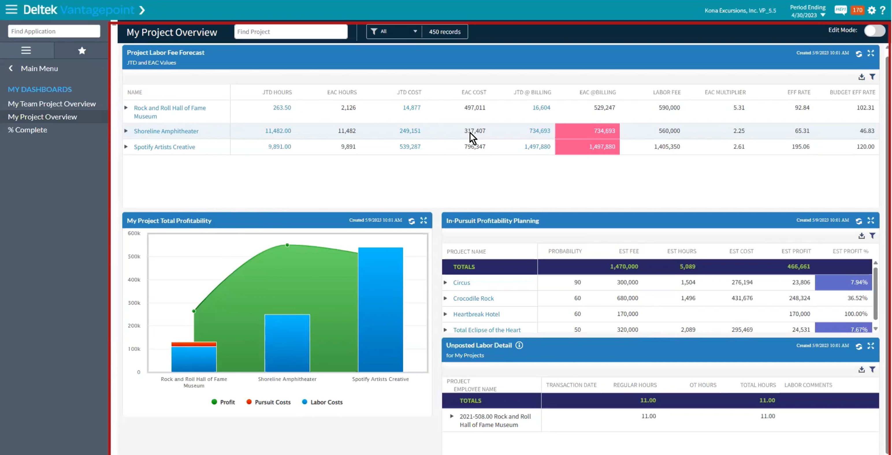
Deltek is advancing "Smarter Projects" by integrating thoughtful AI integration into Vantagepoint, aiming to enhance project management for project-based businesses. By leveraging generative and traditional AI, Deltek will be enhancing automation, improving data accuracy, and saving time. This goal is to support business leaders and project managers in winning and managing projects more effectively, streamlining client relationships, and project delivery. Some examples that are already available include the following.
Client Smart Summaries™ with AI:
- Automatically generates summaries of client information using generative AI.
- Enables executives and project managers to be well-prepared with a comprehensive understanding of client history, ongoing projects, and potential opportunities.
- Aids in nurturing client relationships and winning more projects by staying informed.
Click here to see a Client Smart Summary in action.
Hey Deltek Digital Assistant:
- Utilizes natural language for task management, like setting reminders, adding new contacts, and locating client records.
- Designed to simplify tasks for business development leaders and executives, enhancing productivity.
Capture New Leads on Mobile:
- Vantagepoint CRM mobile app allows for the direct addition of contacts by taking a picture of business cards using Intelligent Character Recognition technology.
- Streamlines the process of capturing new leads and contacts, saving time and reducing manual entry.
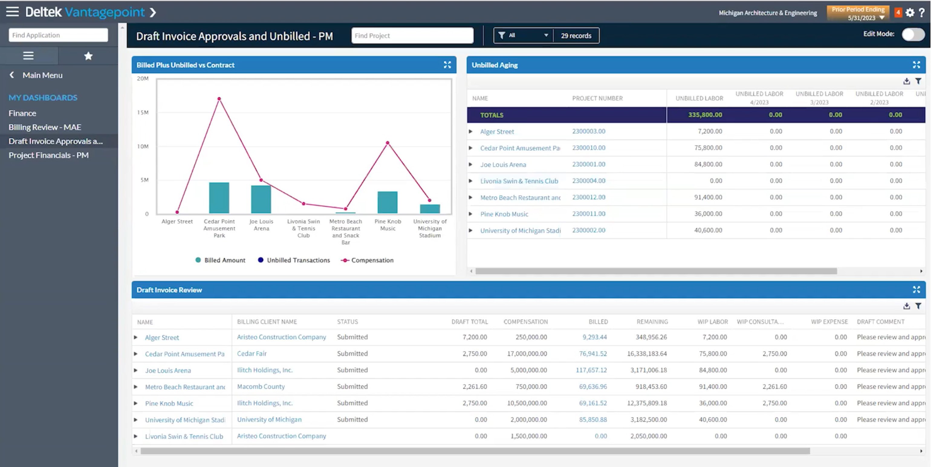
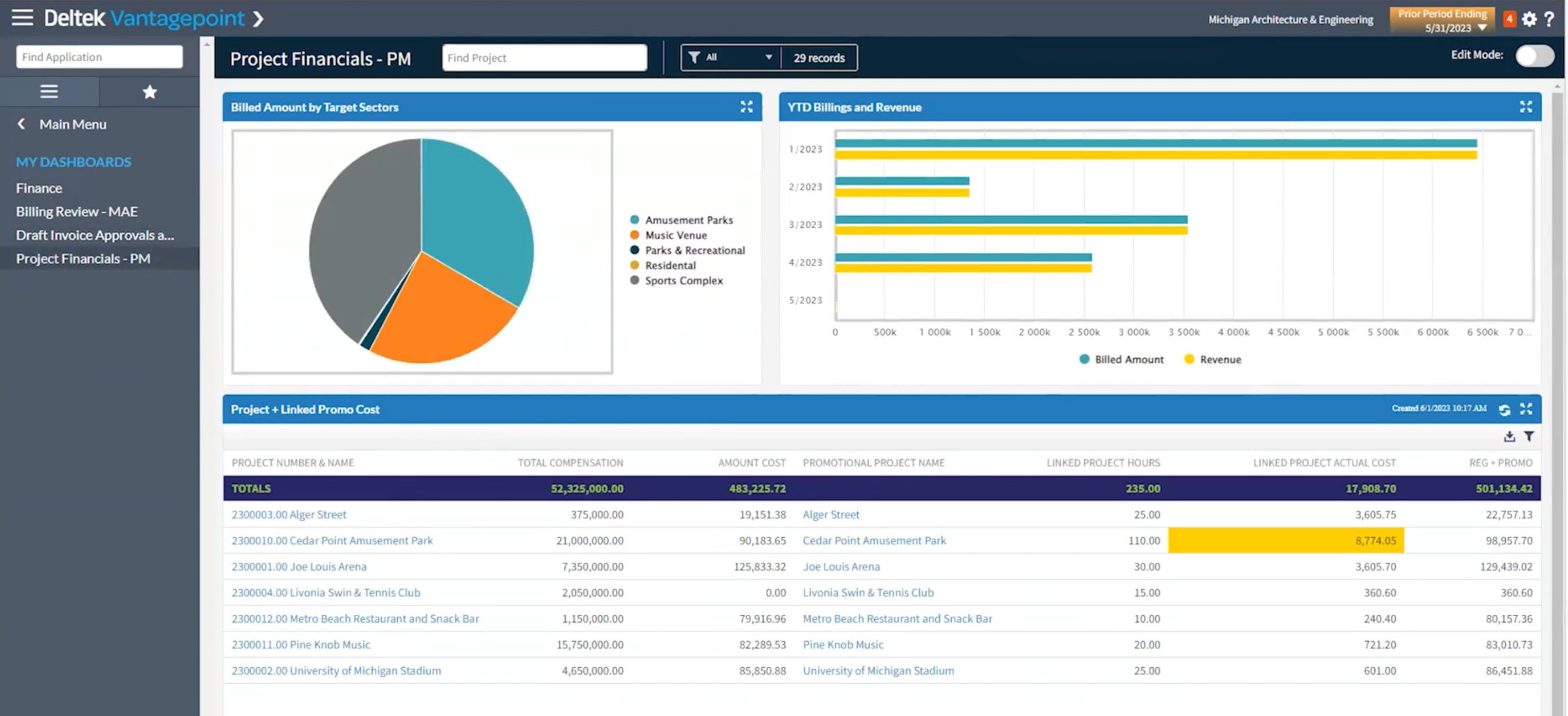
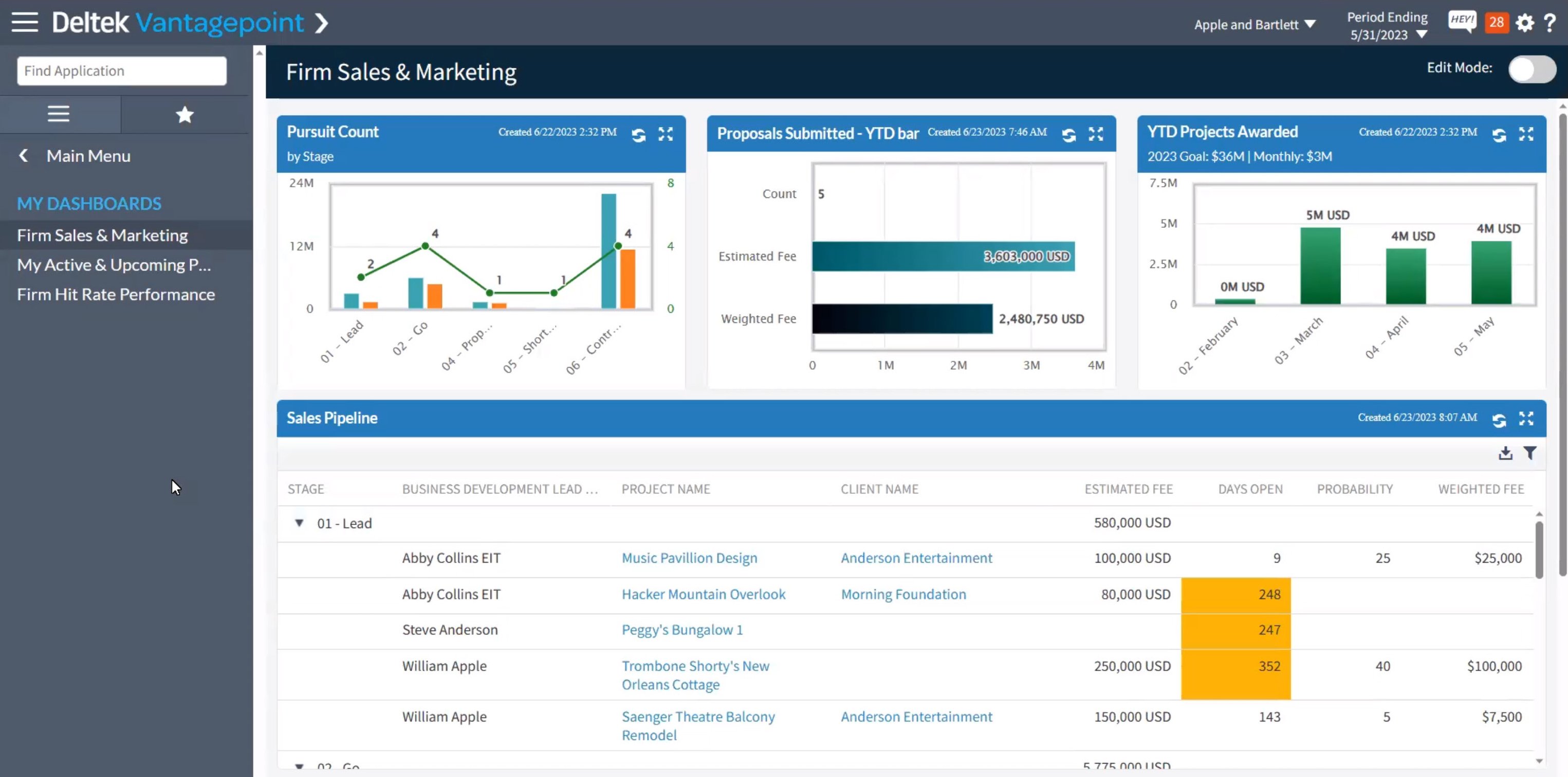
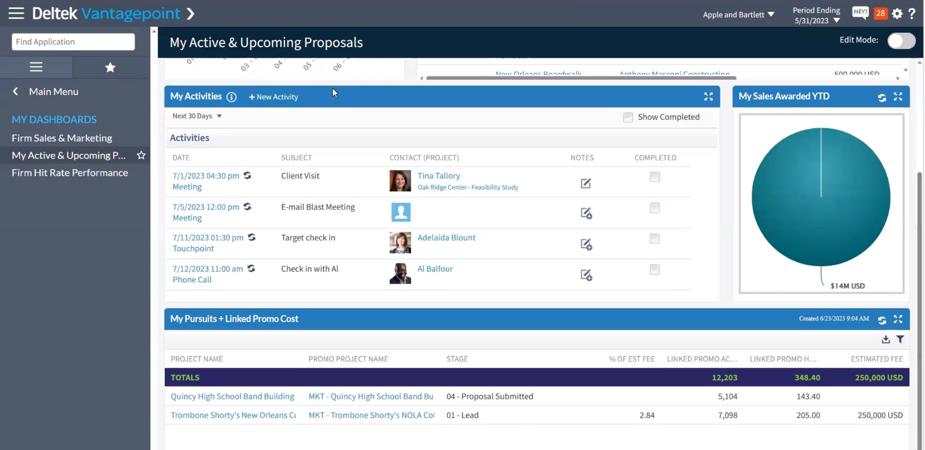
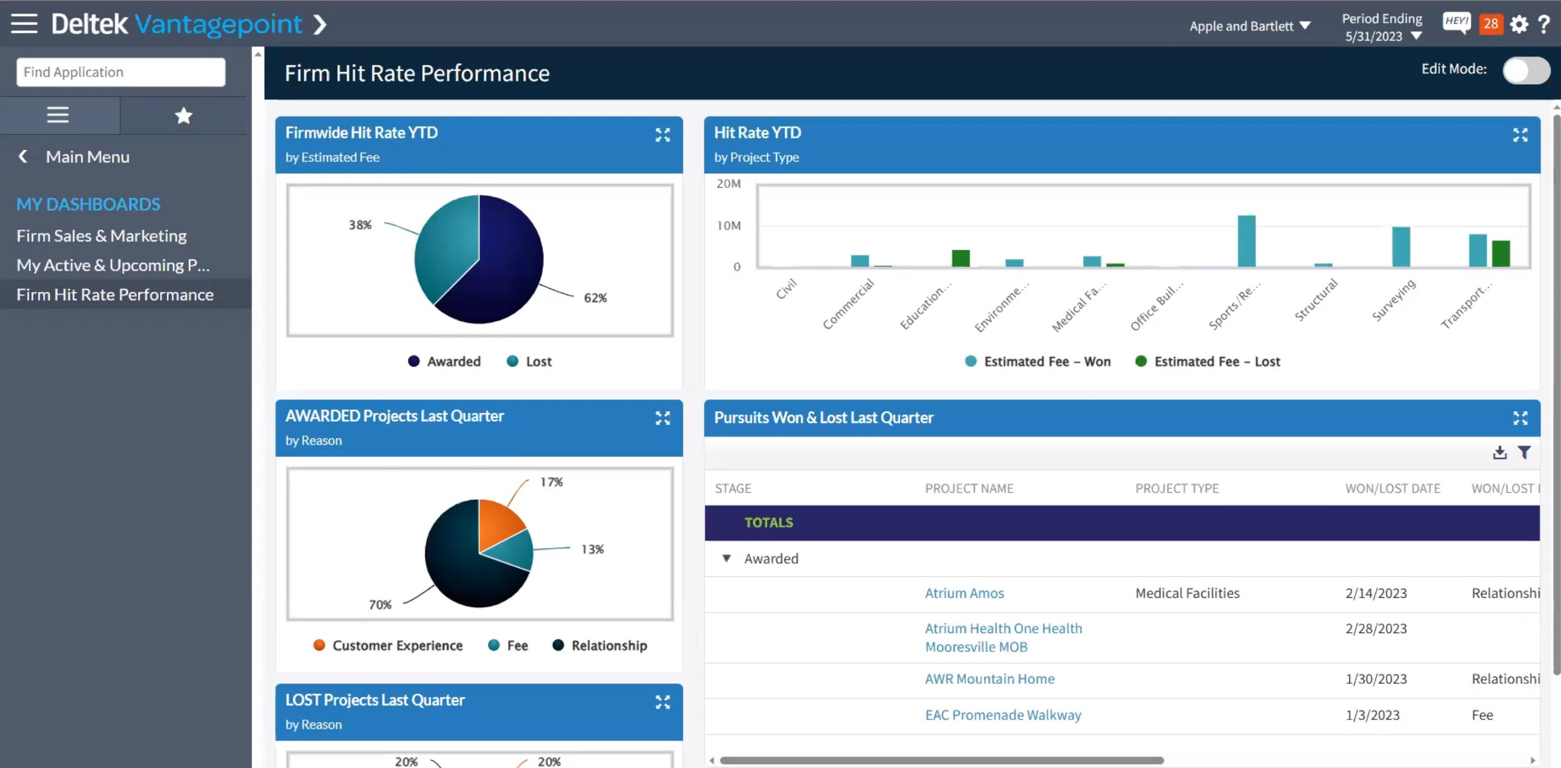
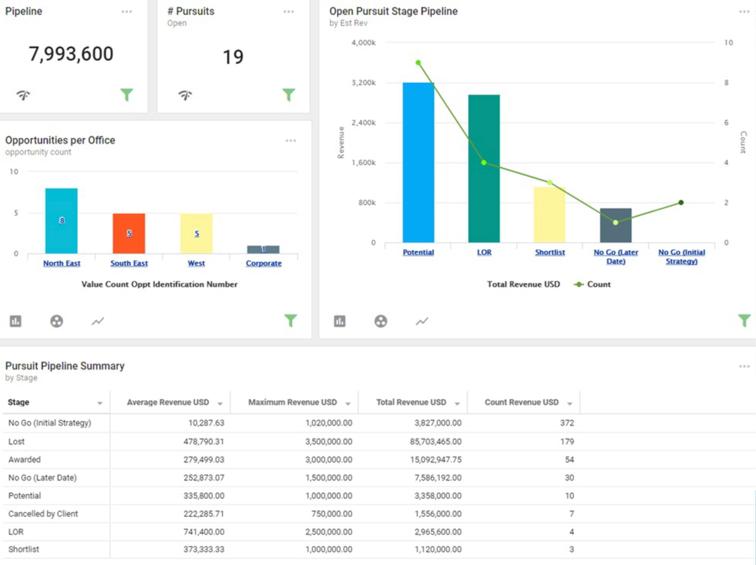
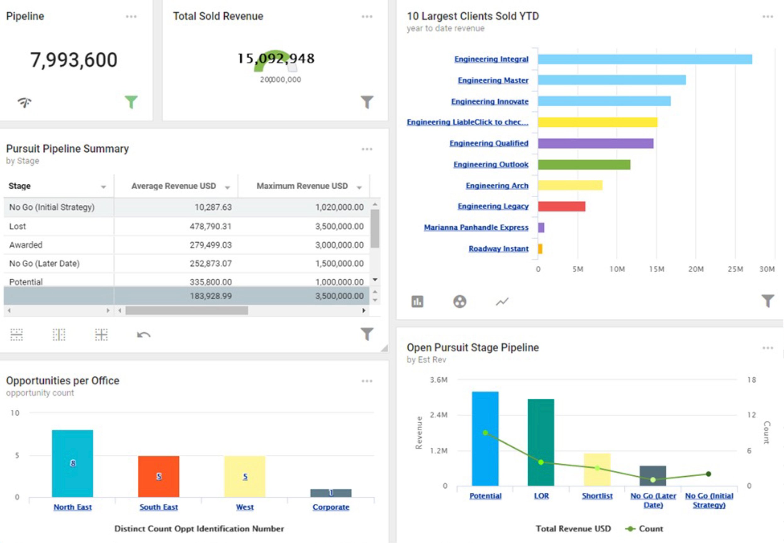
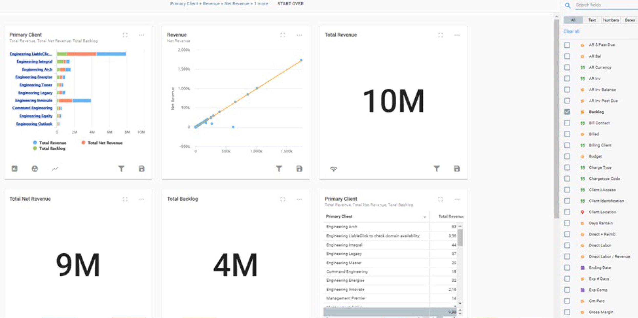
Building a Smarter Pipeline:
- Offers enhanced visibility into project successes and current pipeline, facilitating more informed decision-making.
- Features a visual pipeline view, enabling teams to easily identify opportunities and threats.
- Eliminates the need for multiple reports by providing a unified location for pipeline management.
Deltek's integration of AI and Machine Learning into Vantagepoint is setting a new standard for efficiency and intelligence in project management. With innovations like Client Smart Summaries™, the Hey Deltek Digital Assistant, mobile lead capture, and smarter pipeline management, Deltek is empowering businesses to navigate the complexities of project-based work with unprecedented ease and insight. These tools not only save valuable time but also enhance the accuracy and relevance of data, helping business leaders and project managers forge stronger client relationships and achieve greater success in their projects. As Deltek continues to push the boundaries of technological innovation, Vantagepoint users can look forward to even more advanced features that will further transform the landscape of project management.
It’s Time to Embrace AI and Machine Learning
Identifying and clarifying the difference between AI and machine learning is important since you’ll likely be hearing these terms used interchangeably from now on and far into the future. We have already seen how Deltek Vantagepoint has comprehensive AI and machine learning solutions available for users. And there are even benefits to using AI outside of Deltek solutions.
I’ve found AI to be a handy tool when developing software. AI has changed how we access information on the internet – providing summaries of multiple different search results all at once, offering suggestions from official support sites, and more. AI makes finding answers to problems easier, and even when it can’t provide an accurate answer, AI still manages to point me in the right direction to find the answer.
While most day-to-day use won’t be the same as my own, search engines now have AI supporting their search tools. For example, Bing has an AI chat that can provide context for your internet searches. It even finds answers for you that would usually take digging into multiple different websites to find.
So, this is no longer a thing of science fiction. AI and machine learning have been added to technologies and industries that we interact with daily, providing us with comprehensive solutions to speed up data processing. It’s a science that is here to help, so don’t shy away from using your apps, websites, and smart devices that have AI!
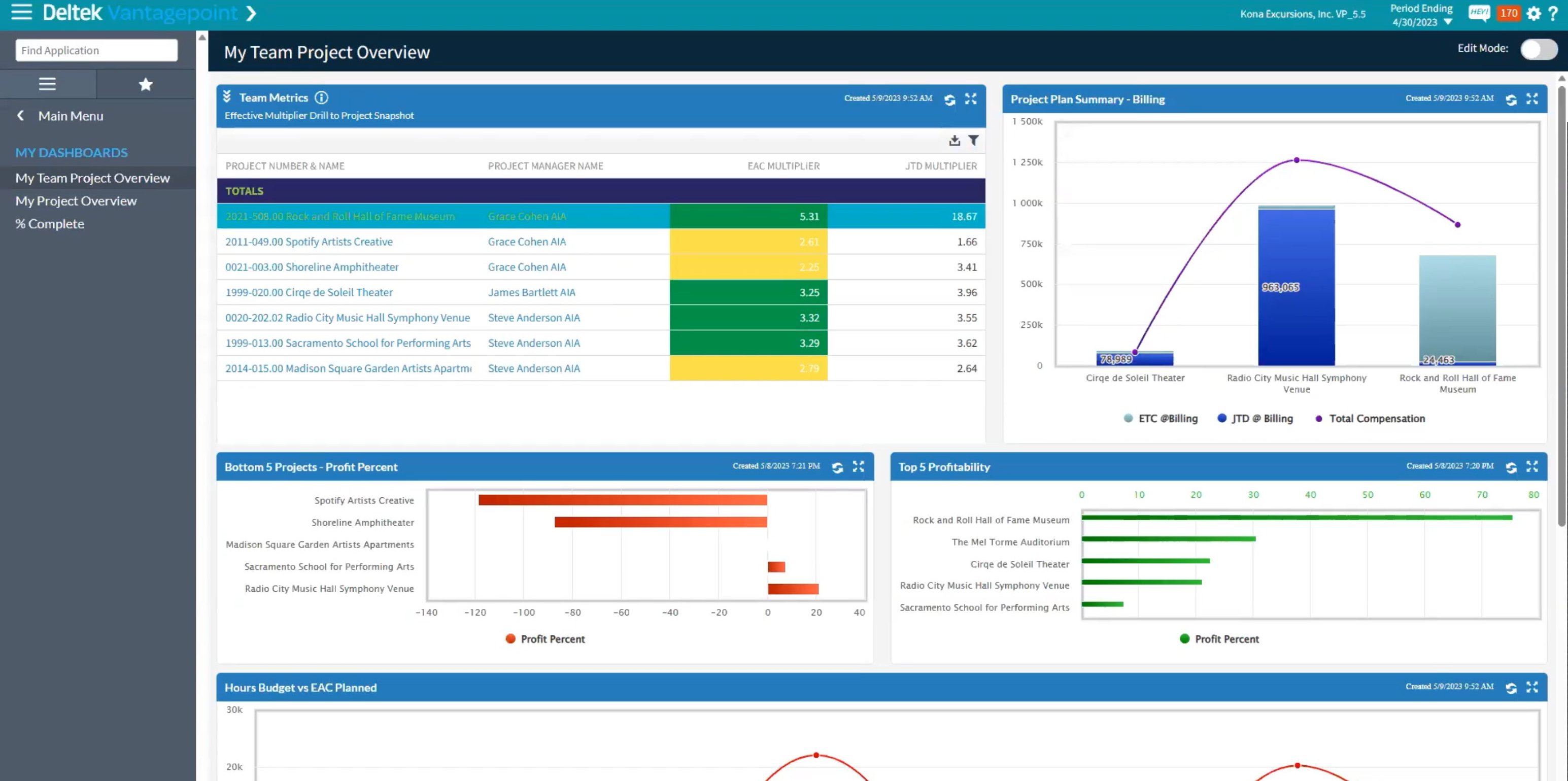
Stay up to date with all of Deltek Vantagepoint's new features by visiting our "Powering Project Success" mini-demo series. Click the image below to watch today.

 Are you making the most of your time and resources? Well, let me tell you about something that can really give you a boost—